Progress Ring Tutorial
July 25, 2022
This post will discuss how to make a progress ring using shaders:
There’s no particular reason for doing this with shaders, practically speaking, there are probably simpler and more performant ways of creating a circular progress ring. However, this approach does not require any graphics assets since it is entirely procedural, and is a nice way to begin experimenting with shaders.
Prerequisites
This tutorial will be using Unity’s shader graph system to implement the progress ring shader, though other similar systems should also work just fine. It’s mainly aimed at those who have an interest in shaders, but maybe haven’t found an approachable problem to tackle. If you’d like to follow along with each step, then basic familiarly with Unity is assumed. If you know how to make a new (URP-based) Unity project, know how to add a quad to a scene, know how to create assets in a project (i.e. by right-clicking in the project view window) and assign materials to objects, then you should have no problem following along.
For reference, Unity editor version 2021.3.0f1 was used for this tutorial, but if you’re using a similar version, it’s unlikely to cause any problems. A Unity project with a completed copy of the shader (as well as a Blender implementation!) is available on github.
What is a shader?
The term shader generally just means ‘code that executes on a GPU’. More specifically, a shader is really just a function with some pre-defined input arguments and output type. Different types of shaders exist depending on what kind of inputs/outputs they work with. Shaders are often used for visual tasks, like coloring in pixels on screen, but they can be used for non-visual computations as well. For the purpose of this tutorial, we’re only going to be making a ‘fragment shader’. This type of shader (i.e. function) takes in data associated with a given pixel and has to return a color, which will be the color of that pixel when it’s rendered on screen. In pseudo code, it looks something like:
python
The important thing to understand is that we’re only responsible for writing the my_fragment_shader function! Figuring out which objects are on screen, which pixels belong to those objects and what data should be associated with each pixel is going to be taken care of for us automagically.
When we ‘wire up’ nodes in shader graph, we’re actually writing the shader function, it’s just graphical instead of text based. Throughout this tutorial, text-based ‘pseudo-code’ will be presented to help explain the thinking behind setting up the shader, often followed by the equivalent shader-graph representation.
What’s so special about shaders?
The most interesting thing about shaders is that they run on the GPU and therefore run in an inherently parallel fashion. In the loop described above, each iteration only depends on data for a single pixel, so each pixel can be processed independently and therefore simultaneously. For problems that fit this ‘parallel’ way of thinking, shaders provide a way to get absurdly fast performance for relatively little effort, at least compared to the difficulty of setting up similarly parallelized CPU code.
More importantly for this tutorial, shaders get you to think about problems from a different perspective than what you may be used to. Maybe that will help you approach other problems in the future, or at the very least, it’s an odd novelty ¯\_(ツ)_/¯
Our approach
As with any complex task, nobody jumps straight to a final working solution in a single step. Rather than starting from a finished shader and trying to explain how it works, we’ll take the reverse approach: starting simple and incrementally working towards the final goal. We’ll first make a shader that draws a circle, then modify this to draw a slice of a circle, then we’ll update this to draw the slice and underlying circle in different colors and finally, draw a ring instead of a full circle. The outputs of each step are shown below:

Drawing a circle
So we’ll start by trying to make a circle drawing shader. We need a 3D object for drawing onto (remember, the fragment shader runs for each pixel in some object on screen) so let’s assume we’re working with a square-shaped quad, you can think of this almost like a canvas that we’re painting on. Let’s say we want a green circle (filled in), with a see-through (transparent background). Lastly, let’s assume we want the circle to be centered on the quad and have a radius that makes it take up half the width of the quad. Phew…

A more conventional/non-shader way of thinking about this problem would be to try to figure out which pixels we need to ‘color in’ in order to draw something that looks like a circle. A little bit like how you might draw or paint a circle yourself, on a piece of paper. However, remember that a shader is a single function that runs for every pixel. So we have no choice but to color in all of the pixels, and instead have to decide what color to pick for each one. Luckily, our per-pixel coloring logic is simple. Imagine we had a function for determining if we’re in the circle called: pixel_is_in_circle. Then, in pseudo-code, we could write our shader like:
python
So each pixel independently determines if it’s in the circle or not, and picks it’s color accordingly. How do we determine if a pixel is in the circle? Simple: a pixel is in the circle if the distance from the pixel to the center of the circle (we’ll call this the circle’s position) is less than or equal to the radius of the circle. In pseudo-code:
python

Ok, we’ve hit our first issue… did you see it? We’re referring to information about the circle (it’s position and radius), but we didn’t pass it into the function or our shader!? It turns out, this is ok. Shaders can be configured to access ‘global’ shared properties (shared across all pixels in this case). In Unity, this can be done by adding properties through the Blackboard in the shader graph editor.
We’ve sort of hit another snag actually… How do we relate the position of a pixel on screen to the ‘center of our quad’ positioning of the circle? It turns out that positioning in the context of 3D rendering is anything but straightforward and usually involves mapping between many different ‘spaces’ depending on what kind of work you’re doing. We’ll keep things simple and work with the UV co-ordinates of the quad, which will already be defined relative to the quad’s geometry.
If you’re not familiar with UV coordinates, they’re just a way of describing points on the surface of a 3D object in terms of 2D coordinates. In shader graph, you’ll often see UV data depicted in colorful red-green patterns:
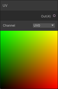
The coloring corresponds to the U-coordinate data (in red) and V-coordinate data (in green), although you can think of it as X and Y coordinates when it’s presented this way. Moving from left to right, we see the image getting more red, corresponding to larger and larger U coordinate values. Similarly as we move bottom to top the image gets more green, corresponding to larger V coordinates. When both U and V are both large near the top-right, we get a lot of red and green together, corresponding to yellow.
In fact, the numerical values of the UV coordinates will go from (0, 0) in the bottom-left corner and then (0, 1), (1, 1) and (1, 0) for the top-left, top-right and bottom-right corners, respectively. That means the center of the quad, and therefore the center of our circle, is at UV co-ordinate (0.5, 0.5). Earlier we also assumed that the circle would take up half the width of the quad, which has a width of 1 (in UV units) and therefore the circle diameter must be 0.5 and the radius would be half of that, or 0.25.

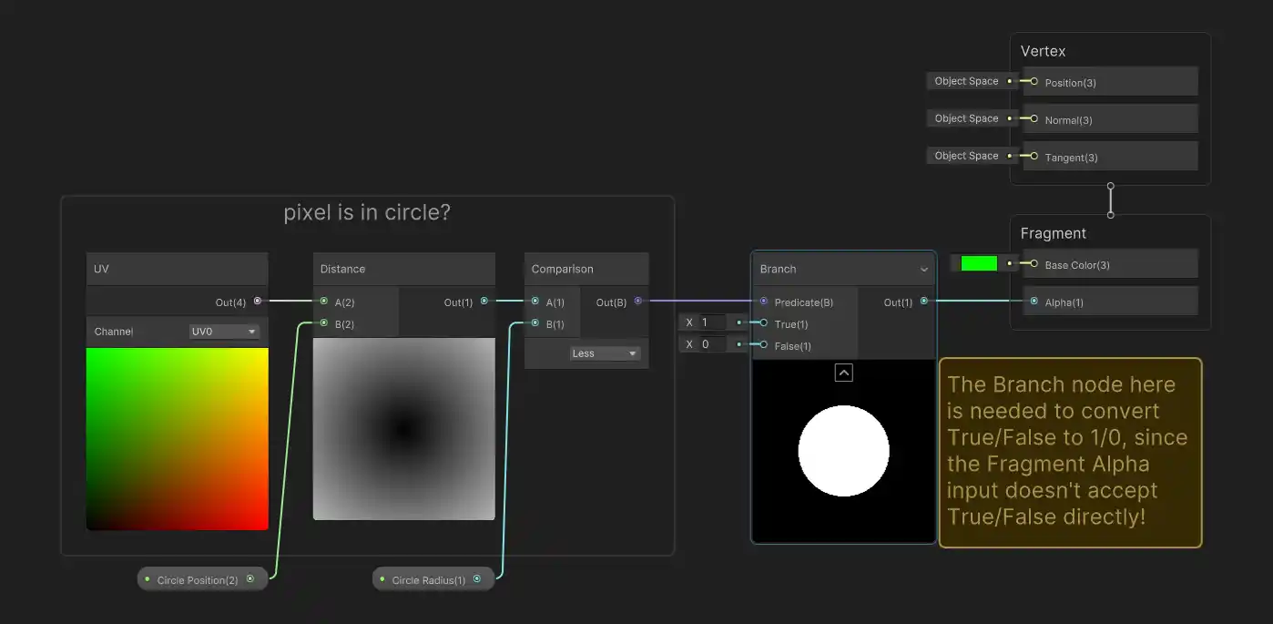
We’re almost there, the last thing we need to figure out is how we calculate the distance between two positions. While we could calculate this ourselves, we don’t actually need to! Unity has a distance node built-in. So we have everything we need to implement our pseudo-code in shader graph. Start by creating a new unlit shader. In the shader graph editor, make sure to enable transparency by opening the Graph Inspector (usually in the top right) and under the Graph Settings tab, set the Surface Type to Transparent:
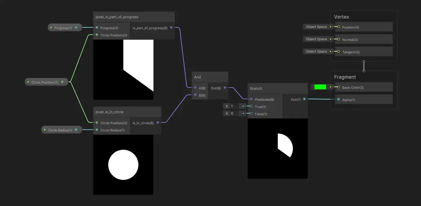
This lets us use alpha values to ‘cut-out’ parts of the quad that we don’t want to show. Then we can wire up the following graph (use spacebar or right click to add nodes, add controllable properties using the Blackboard) to get a simple circle renderer:
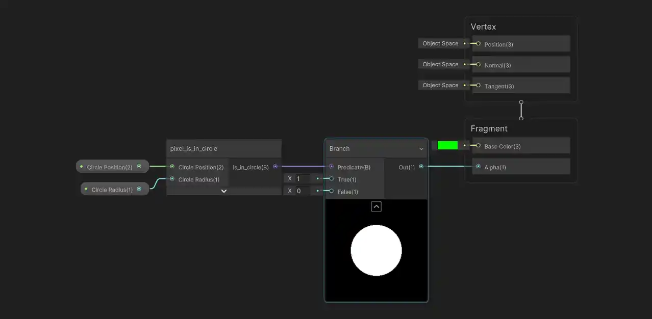
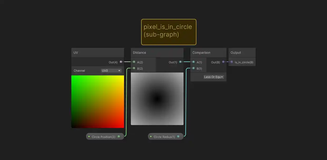
For the sake of clarity, I’ll regularly be bundling sections of the graph into their own more compact sub-graphs. This can be done by selecting a group of nodes, right-clicking and then choosing Convert To > Sub-graph in the menu. For example, we can convert the ‘is in circle’ logic to it’s own sub-graph (almost like a separate function!):
You don’t have to do this if you’re following along, wiring up all the logic in a single graph works just fine, but here’s what the sub-graph looks like in this case:
One thing that may look strange is how we’re using our logic as an input into the alpha channel of the Fragment block, instead of the base color. By doing this, we’re actually saying that we want the entire quad to be green and that areas outside of the circle shape should be transparent. While this may seem a bit odd, it’s simpler than having to separately say that we want a green circle shape and also an opaque circle shape that’s perfectly aligned to the green shape.
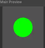
Though the shader graph representation doesn’t show it, here’s what the actual preview output looks like with both the base coloring and alpha in effect applied to a quad:
One last note before we continue, if you actually want to use this shader, you’ll need to create a material out of it and then apply that material to an object (a quad, in this case). If you right-click on the shader in the Project window and choose Create > Material, you’ll automatically get a material that uses the shader. Any properties you add through the Blackboard (the circle position and radius in the example above) will appear as controllable parameters on this material, accessible through the regular Unity inspector window!
How to slice a pie
So we can draw a fully filled in circle, but how do we draw only a fraction of the circle to mimic our progress bar behavior? To start, let’s first assume that our progress amount is always going to be a value between 0.0 and 1.0 (i.e. 0% to 100%), corresponding to how much of our progress indicator should be filled. Let’s also say that we want our indicator to ‘fill in’ starting from the top and then in a clock-wise direction.

In pseudo-code, we have something like this:
python
We already have the pixel_is_in_circle function from before, but now we need a pixel_is_part_of_progress function to decide what parts to fill in. This may seem complex, but it’s fairly simple as long as we think in terms of angles, and remember, we don’t have to worry about the circle shape itself, we already took care of that earlier.
We can think of the start of our progress indicator as being at an angle of 0 degrees and filling in 360 degrees around the circle based on the progress percentage. In a perfect world, we would use an angle that goes from 0.0 to 1.0 (instead of 0 to 360 degrees), so that we could directly compare this value to our progress amount. We could think of this as a normalized_pixel_angle and then we could write a very simple progress check: all pixels whose normalized angle is 0.0 up to the current progress amount should be in the indicator. Since we don’t expect to have negative angles, this is the same as checking for normalized angles that are less than or equal to the progress amount:
python
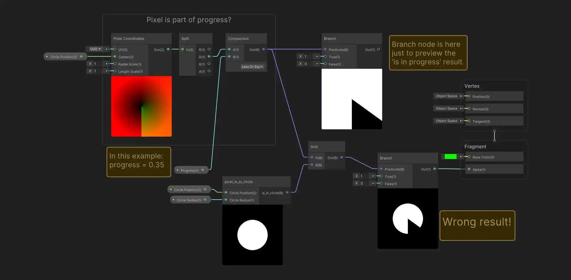
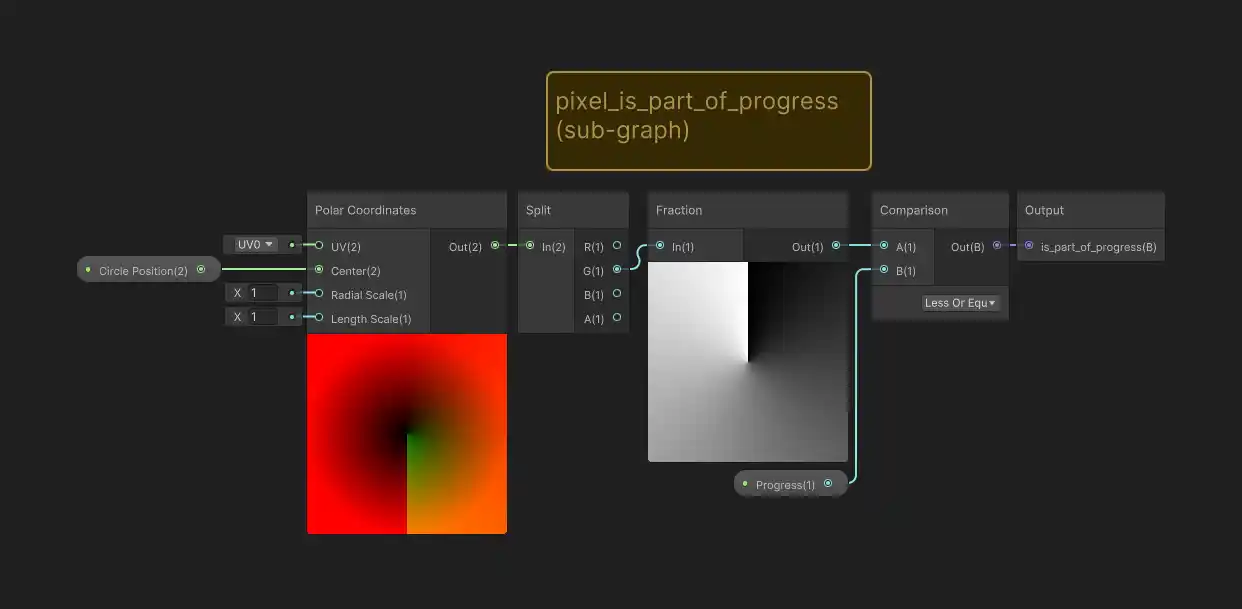
As before we could calculate this pixel angle ourselves using trigonometry, specifically using the atan2 function, but Unity has a built-in function that does this for us: the polar coordinate node! The polar coordinate node outputs a 2D vector, where the second component (i.e. the y or green component of the vector) contains angle information. However it’s not quite in the convenient 0.0 to 1.0 (starting at the top) angle format we wanted. If we use it as-is, we run into a problem:
In fact, the angle that comes out of the polar coordinate node is 0 at the top, but goes to -0.5 at the bottom moving counter-clockwise, and +0.5 moving clockwise. You can sort of see this from the discontinuous step in the green coloring on the bottom half of the polar node preview image. Fixing this is simple, but hardly obvious: we can use the fraction node. This node gives you the difference between the number you provide as an input and the rounded-down-to-the-nearest-integer version (also known as the floor value) of that same number. For a value of -0.2 for example, the rounded-down integer is -1, so the fractional node gives the difference: (-0.2) - (-1) = +0.8. This calculation will always give a positive number between 0.0 and 1.0. When we add this to our graph, it fixes the problem! We only include pixels that are within some (normalized) angle rotating clock-wise from the top. Here’s how it looks after converting to a sub-graph:
The fraction node gives us the correct 0.0 to 1.0 range we wanted, but it also happens to give us the fill direction and starting point we wanted as well! The following interactive diagram may help explain why we get this result. The two plots show the polar angle node output (left) and result after the fraction node (right). The brightness indicates the angle value, 0 is black, 1 is white, but you can hover the plots to see the exact value under your mouse cursor. When hovering the plots, you’ll also see the fraction node calculation displayed in the middle. Try hovering to the left side of the plots to see how the fraction node alters the original negative range of angles into positive values:
Polar Node Angle Values
Hover to see calculation
Fraction Corrected Values
Putting things together using sub-graphs, we get a graph that looks very similar to our pseudo-code from earlier, the only oddity here is again the Branch node, which we need to use because the alpha input doesn’t accept True/False values directly:
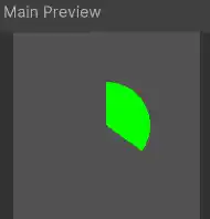
And here’s how the preview image looks, with color and transparency in effect:
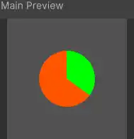
Very cool! But we can do a bit better: it would be nice if the circular areas outside of the progress indicator were still visible instead of being transparent. So we want to have a background color (orange for example) for the circle and a foreground color (still green) for the ‘in progress’ slice. Everything else outside the circle should still be transparent. At first glance, this seems like a difficult modification to make, so again let’s try to describe it with pseudo-code:
python
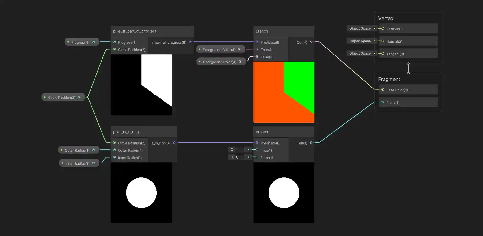
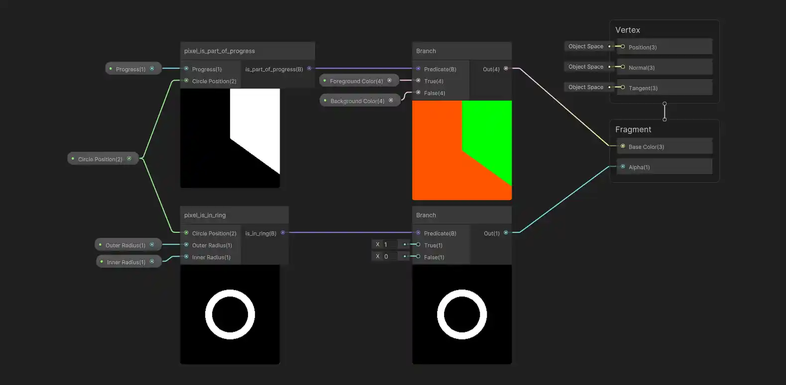
Ok actually not that difficult looking at all! This translates to something very similar in shader graph, though because of the distinction between color and transparency, the wiring looks a little funny:
Compared to our previous graph, all we’ve really done is used the progress data to select between foreground/background colors instead of using it to control the alpha. As we did earlier, we’re saying that the in-progress segment should be green (foreground color) and the rest of the entire quad should be orange (background color), and then using the alpha channel to cut-out the circular shape.
Here’s how the preview image looks:
And finally, a ring
We almost have a working progress ring shader, we just need to convert our circle shape to a ring. If you’ve followed along this far, you might already have an idea of how to do this (and if so, give it a try before continuing!). As always, let’s think about the pseudo-code version first:
python
It almost looks like I copy-pasted the code from before without adding anything, doesn’t it? In fact, I just changed the pixel_is_in_circle function to pixel_is_in_ring, and really that’s all we need to do. As a reminder, our pseudo-code for checking if we’re in a circle is:
python
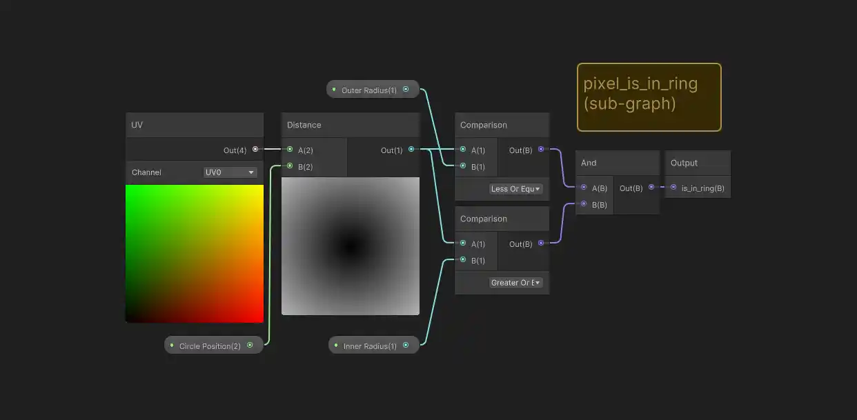
Changing this to check if we’re inside a ring shape is pretty easy, a ring is just a big circle with a smaller circle ‘missing’ from the the center. Let’s think of the original circle radius as being the ‘outer radius’ of the ring, and we’ll also introduce a value for an ‘inner radius’. Then, we can say that a pixel in within the ring if it is between the inner and outer radius values:
python
And believe it or not, we’re done! Here’s how the sub-graph looks for our new ‘is in ring’ check:
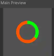
And suddenly we have our progress ring shader:
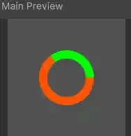
Here’s what the output looks like on a quad using an outer radius of 0.25 and an inner radius of 0.18:
Practical Considerations
We really are done, you can play with the shader controls (e.g. the progress amount, the colors or even the ring radius) in the Unity inspector window and watch the changes take effect immediately in the scene view. However, there are a few more things that are worth considering for real-world use.
Controlling the progress through code (C#)
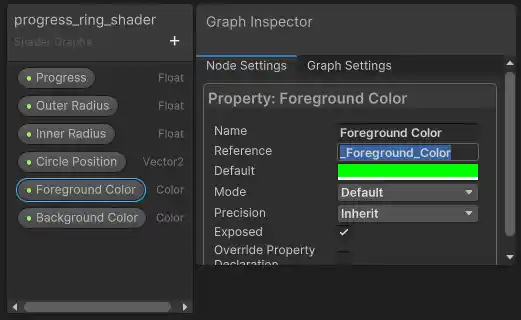
Sooner or later, we’re going to want to control the progress value through code so that we can make the ring fill up according to some value we’re tracking. In Unity, this requires setting up a C# script that references the progress property we assigned to the shader (seen as Progress (1) in the shader graph image above). We need to be careful here, because in order to control the property, we actually need the internal reference name, not the outward label that is assigned. To check the internal reference name (and even change it) click on the property name within the Blackboard in shader graph and then open the Graph Inspector, the reference name will be shown under the Node Settings tab, shown here as _Foreground_Color for the foreground color property:
With this information, we can create a simple script to control the property. In this case I’m going to control the progress property (called _Progress internally), but the same code works on any property, as long you use the correct data types. Simply create a new MonoBehaviour C# script and attach it to the game object (the quad in this case), I called my script ProgressControl:
csharp
This is a super simple example that will cause the ring to fill up over the first 15 seconds after starting the game. After 15 seconds, the ring will stay full, since the progress value will go above 1.0. Of course you can use a value from somewhere else in your game to drive the progress bar, instead of just the game time.
In practice, there are some issues with this implementation. For one, we’re repeatedly getting the renderer component on every update. You’re better off caching this ahead of time, in the Start or Awake functions for example. Similarly, we’re referring to the progress name variable using a string, but it’s better to cache this ahead of time using Shader.PropertyToID. Lastly, the way we’re accessing the material on the renderer creates a new instance of the material, which may not be what you want, instead you might want to consider using MaterialPropertyBlocks. These issues are all general Unity-isms, nothing too specific to shaders, but important to look out for nonetheless.
Partially transparent colors
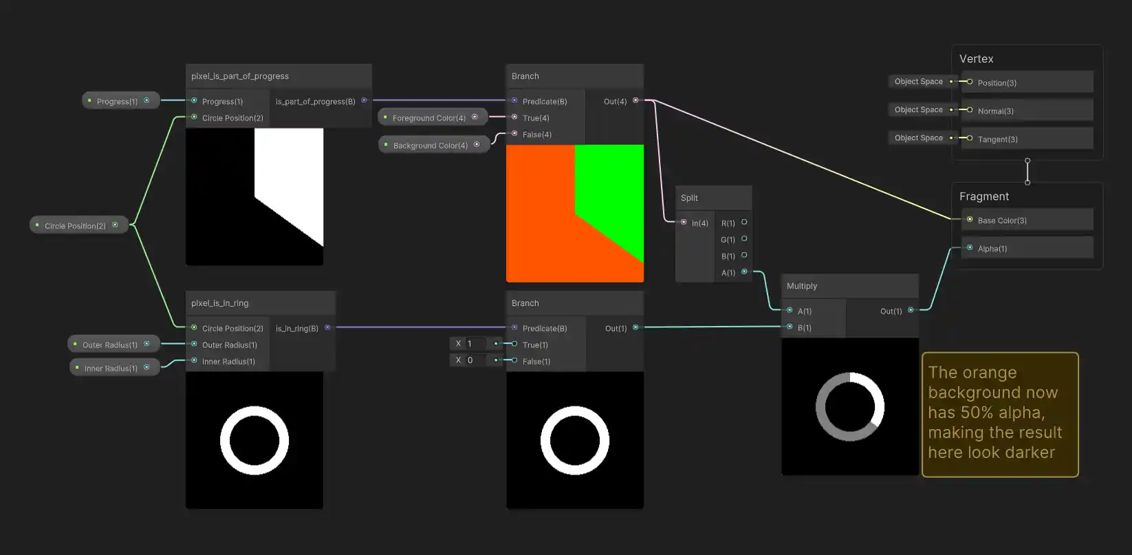
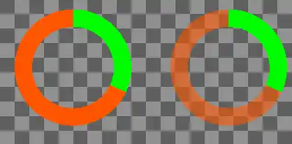
What if we want our ring background color (or even foreground color?!) to be slightly transparent? It’s actually not too difficult and gives a cool looking affect. The trick is to split out the alpha channel of the color we currently generate and use it to scale down (through multiplication) the ring alpha we were already setting:
Then if we just set the alpha values of our colors to something other than 100%, we get transparency! Here’s a comparison between setting the orange color alpha to 100% (i.e. completely opaque) vs. 50% (i.e. partially transparent), while the green color has 100% alpha in both cases:
Changing the starting point
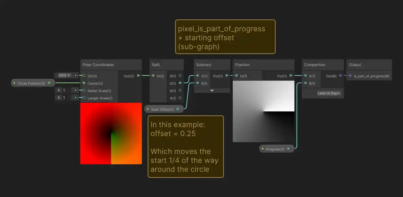
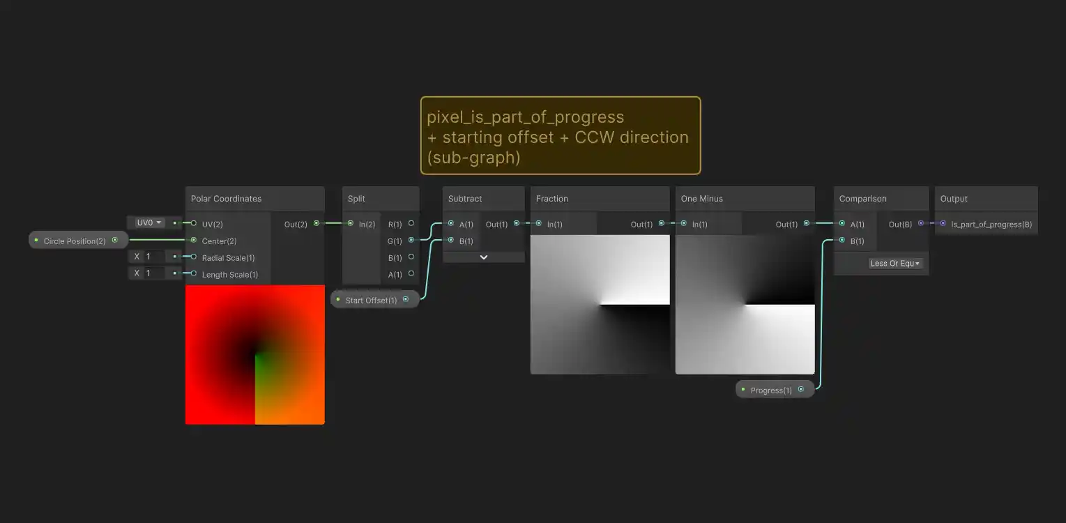
What if you want the circle to start filling in from somewhere other than the top? Earlier we relied on some unintuitive behavior from the fraction node that just happened to give us a nice result when figuring out which pixels are part of the progress indicator. Luckily, it’s very easy to modify our ‘is part of progress’ logic to get a different result if we want, we just need to offset the values going into the fraction node with a subtraction:
Shown here, the starting point input (provided to the newly added subtraction node) has a value of 0.25, which moves the starting point 1/4 of the way around the circle (starting from the top going clock-wise). Here’s how it looks in preview:
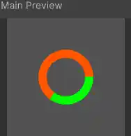
Different starting point values can be used to move the starting point around the circle. For example, A value of 0.5 would put the starting point at the bottom edge, 0.75 would put it at the left edge and so on.
And what if you wanted to flip the filling direction, so that it was counter clock-wise?
The fill direction can be reversed by adding a ‘one minus’ node just after the output from the fraction node:
Consolidating Duplicated Code
If you’re familiar with polar coordinates, you might have noticed that the first channel (i.e. X or red channel) of the output from the polar coordinate node contains distance information which we left unused. In fact, this is the same kind of distance data (though it has a scaling factor of 2 applied!) that we calculate inside of the ‘is in circle’ and ‘is in ring’ sub-graphs (though we used UV and Distance nodes in those cases). If you’re actually planning to use this shader and want a slightly more efficient implementation, consider re-organizing the graph so that both the polar angle and distance outputs are used.
Fancy shaders
In real-world examples, you may find that shaders often use more purely number/math-based solutions in place of if/else logic. Though the reasoning ends up being harder to follow, there are some real benefits to preferring numerical solutions. One major concern is that branching statements can lead to poorer performance, whereas numerical implementations can be faster. Arguably a more interesting benefit is that the use of numerical representations can provide support for blending or softening of transitions between values. Our circles/rings have jagged edges for example, a result of the very sharp transitions caused by our use of if/else statements. What we’d really like is to replace statements such as:
python
With something that behaves in a more continuous way, like:
python
This kind of logic isn’t directly available, but we can use numbers to mimic the behavior: returning 1.0 instead of true, 0.0 instead of false and then using the 0.0 to 1.0 range to represent the in-between true/false states. The example below shows a modified version of the shader that makes use of this sort of fuzzy logic to allow for blending. At low values, the blending acts as a sort of anti-aliasing, while at higher values it can mimic an out-of-focus effect. Try disabling and re-enabling the blending to see the difference between the original (jagged) result and the smoother blended result.
Explaining how to implement blending probably deserves it’s own post. For now, if you’re interested in this sort of effect, I’d recommend looking up the smoothstep node, which allows for the fuzzy logic described above, as well as the lerp node which is purpose built for blending between values.
Conclusion
In this tutorial, we tried to take a very straightforward approach to making a shader that draws a progress ring, relying on simple human-readable logic blocks to implement each of the operations we needed to perform. The most important take-away is to think in terms of a single shared ‘per-pixel logic’ that is applied to all pixels in order to generate the desired output. It would be an understatement to say that we’ve only scratched the surface of what is possible with shaders, but hopefully it’s helped demystify, even slightly, how shaders can be used to draw stuff in any unconventional way.

